SACBÉ

/2025

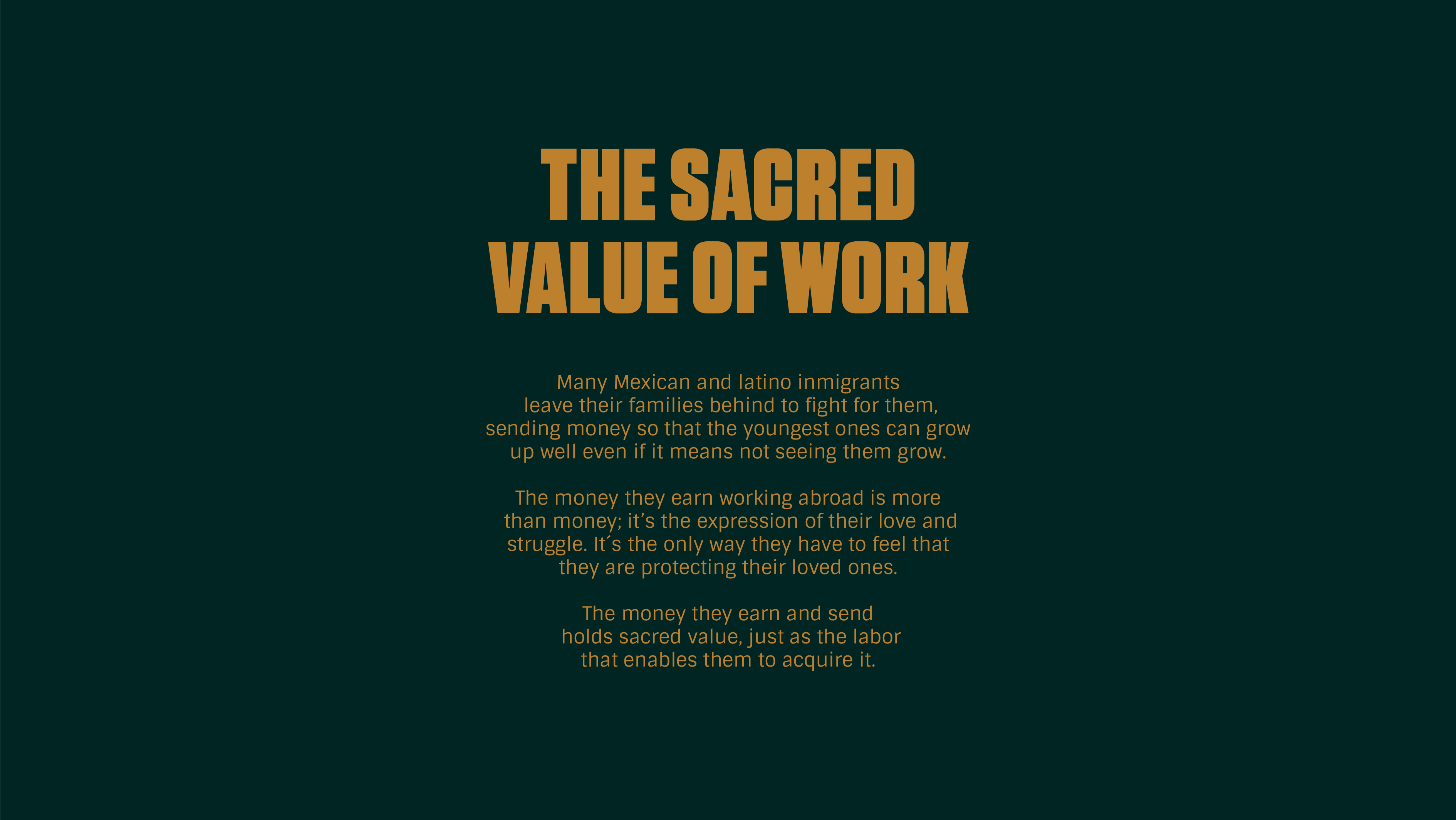
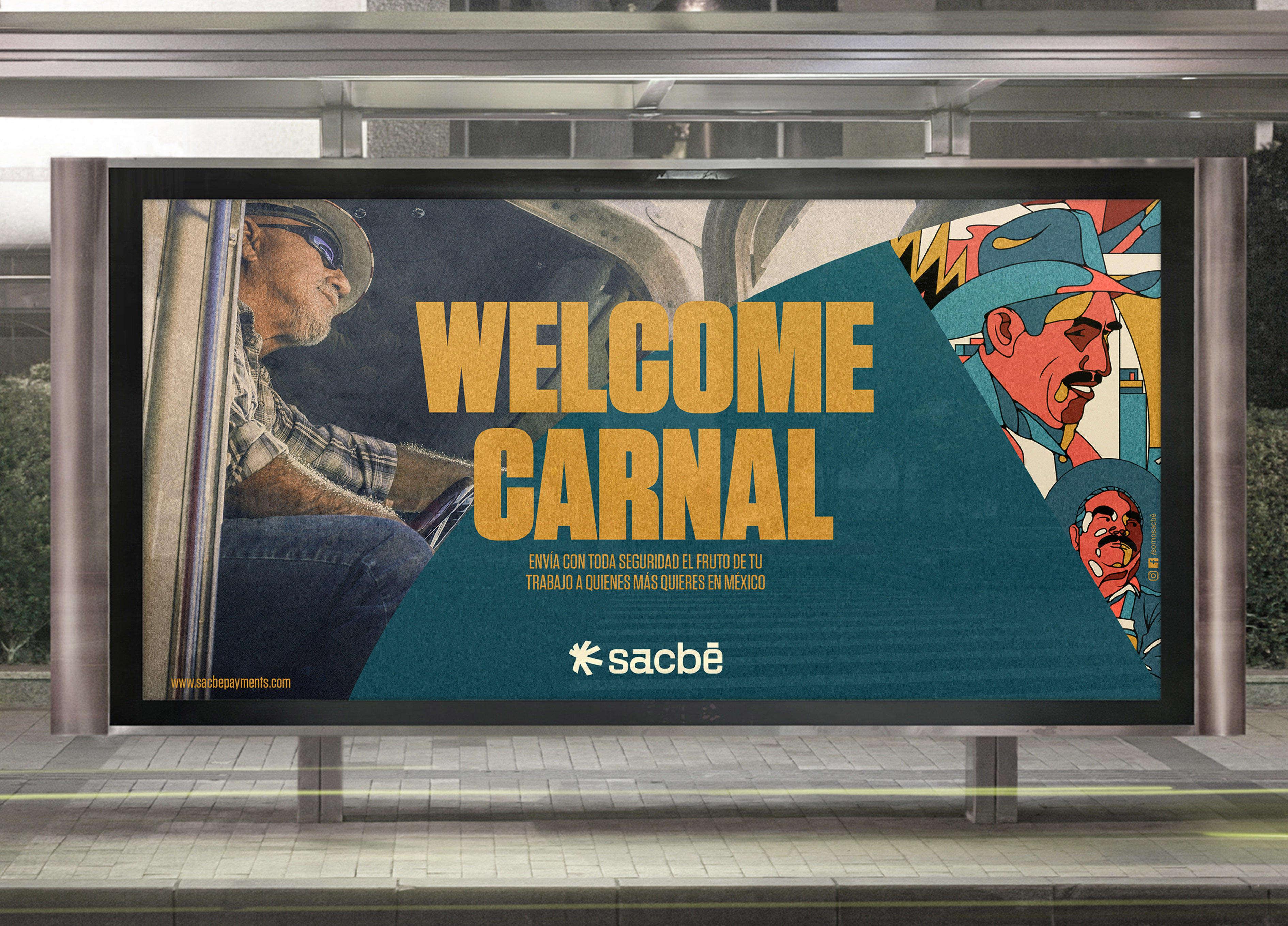
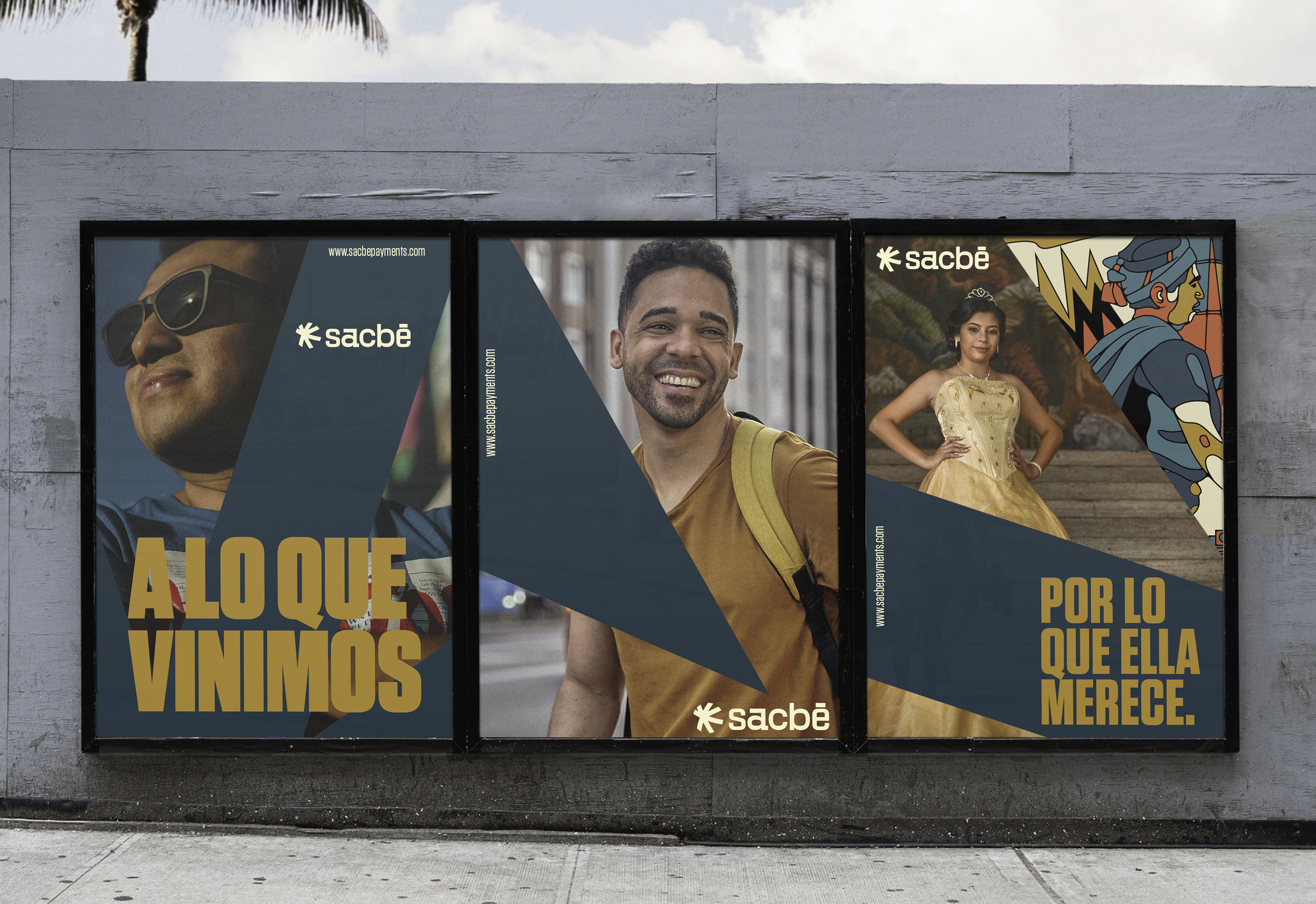
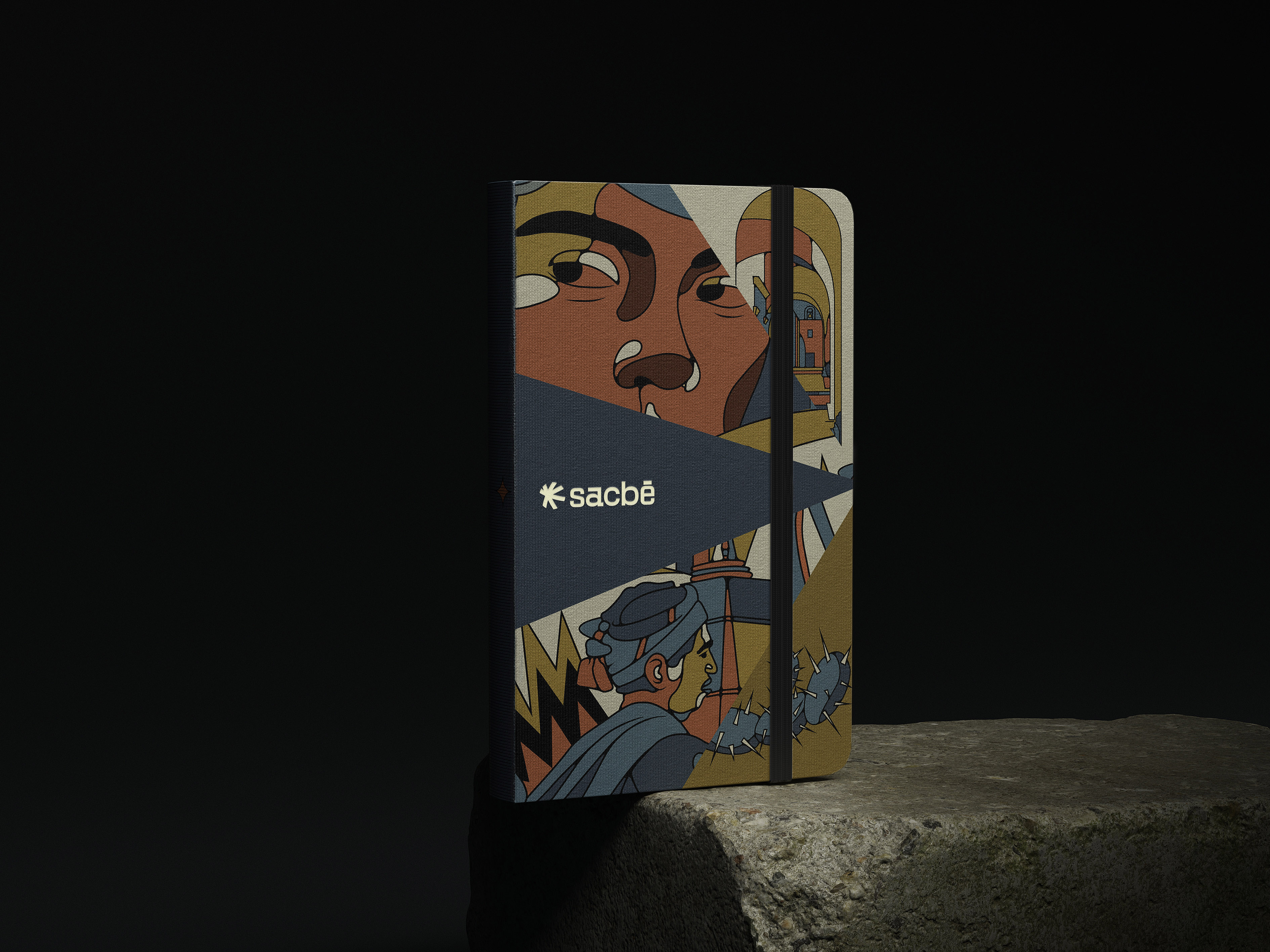
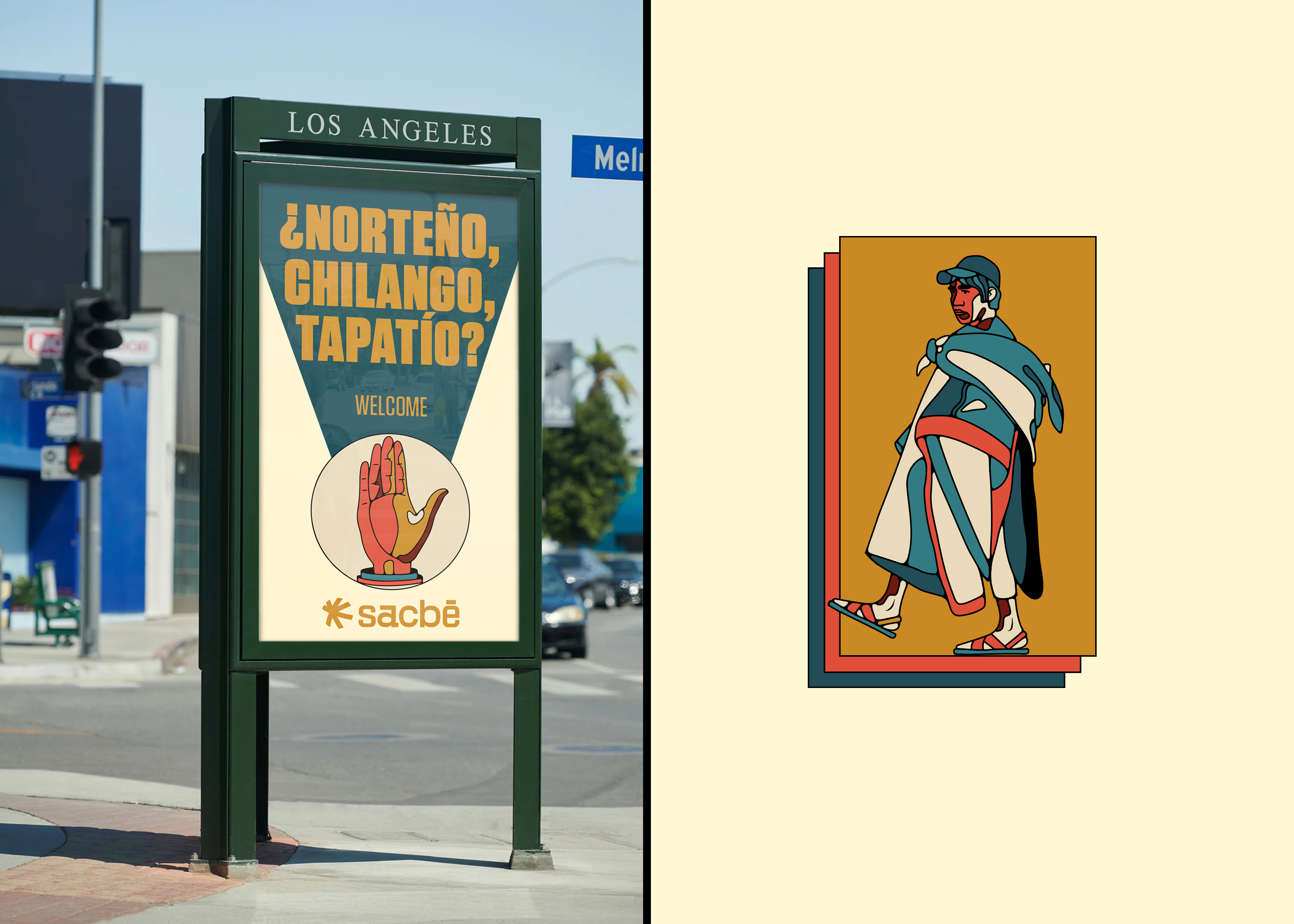
SACBÉ is a fintech with a vision to serve as an inclusive gateway for Mexican and Latino immigrants in North American society, who often face inherent rejection. Specifically, they encounter barriers within the financial realm, where doors are closed, restricting their ability to freely transfer and accumulate the value of their hard work and establish generational wealth. Our mission is to integrate them by providing access to essential services that their undocumented status would otherwise prevent them from obtaining. This includes integrating them into the financial system, offering a low-cost remittance service that outshines the rest of the market.

CROSSROADS GRAPHIC SYSTEM

The graphic system is based on the concept of crossroads, which also inspired the isotype. This flexible graphic system allows the brand to create consistent layouts that can balance text, illustrations, and photographs in a playful manner.

BRAND CONCEPT: A LO QUE VINIMOS

If there's a Latin cultural expression used to remind us why we are somewhere, it's 'A lo que vinimos,' which could be translated as "What we came for." It's a trigger to go out and fight, and a guide to not lose our way. That's why it's a wonderful opportunity to embrace it and turn it into a kind of mantra among immigrants.

Client: Ad.ventures / Sacbé Visa

Scope: Brand Strategy, Brand design, Illustration

Art Direction & Illustration: Sebastian Betancur

Motion Graphics: David Abril Alfaro

/BUTTON TEXT/